We are just under three months away from the wedding! I can't believe how close we are to our wedding day. We have had such a long engagement that it has always felt like the wedding is eons away. Now that it's coming up so fast, every decision feels surreal.
Being at the three month mark, our wedding planner has been on us about ordering invitations, and of course, she's totally right. For some reason, invitations were one of the more difficult decisions for me to make. I think I began to get overwhelmed by all my options.
From the very beginning, I have waffled on the type of style I favor. I wondered if a rustic or vintage look would be the way to go to match our wedding theme.

Rustic Lace Wedding Invitation from DawnMarieCreations82 on Etsy.com

Pink Shabby Chic Invitations from Jinaiji on Zazzle.com
Even though these invitations would match the wedding's "theme," I really didn't feel like they are very "me." I would rather have something with a pop of color, because I love color, and I knew we could still find something that would coordinate with the wedding.
I heard a lot about Basic Invite, where the colors are fully customizable, and I thought that might a great option for us. I found some gorgeous invitations that I really loved, and customized them with our wedding colors.
This is called the Illustrated Corner Wreath, and here's how it would look in our wedding colors.

Invitation

Reply Card

Reception Enclosure
We could have gotten 85 of these for between $300 and $400, which is what I was prepared to pay in the budget, but I still hesitated a little bit. That still seemed like a lot of money to pay for something that most people just eventually throw in the trash, and for whatever reason, I still wasn't positive that these were exactly right for the vibe of our wedding.
I looked around at some of the beautiful invitations on Minted and Wedding Paper Divas, but I also wondered if it was possible to find something I loved on my old friend, Vistaprint. After all, that would certainly be the most cost-effective, and it would also leave us with enough left over to spare for upgrading to nicer paper and such.

Invitation

Reception Enclosure

Response Card
These are located here at Vistaprint's website. They seemed just ok when I was designing them. I think my main problem with these and the invitations from Basic Invite was all the white space. I know that's traditional, but I thought I could find a design better suited to us.
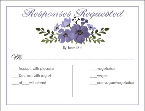
Enter these lovelies. The colors are right, and I love the monogram at the top and the purple borders around the edges.

Invitation
Reply Card

Reception Enclosure

The back of our invitation and reception enclosure have our monogram written horizontally, like this.

We also threw in envelope seals. We might not use them, or we might use them on favors instead of on the invitations, but they were a great deal.
I played with the font sizes and designs a little bit, and customized my reception card completely because Blue Mom requested to know ahead of time how many people will be eating vegan, vegetarian, and meat. That will make it easier for us to order the proper amount of everything from the caterer.
Aside from all you see here, I ordered brown kraft outer envelopes from a different company, and we're going to use the envelopes that Vistraprint supplies as inner envelopes. We ordered the invitations and enclosures on linen pressed paper. All told, our total hovered around $180. We can't beat that price, and I am super happy with the design I chose.
How did you pick invitations?


0 comments:
Post a Comment